
When a website ranks on Google’s first page but looks stuck in 2005, that’s a problem. When a website seems stunning but can’t be found in search results, that’s an even bigger problem.
Modern SEO demands more than keywords and backlinks — it needs thoughtful design decisions. Web design and SEO must work together through fast-loading pages, clean navigation, and mobile-friendly layouts that directly impact your search rankings. In this post, we’ll show you how to master design and SEO with practical examples using powerful tools like Divi. Let’s dive in.
Why Design & SEO Need To Work Together
The relationship between web design and SEO has evolved far beyond the days of keyword-stuffed HTML pages. Google now evaluates entire website experiences, from load times to user navigation patterns, making design choices crucial for search success.
User behavior tells the real story. A slow, cluttered website triggers immediate bounces, while clean, fast-loading designs keep visitors engaged. These engagement metrics directly influence search rankings, turning design elements into powerful SEO signals.
The data supports this connection. Sites loading under 2 seconds see double the average session times compared to slower alternatives. Clean navigation menus reduce bounce rates, while mobile-friendly designs create higher engagement rates. These statistics demonstrate why web design and SEO must be considered interconnected rather than separate disciplines.
Beyond surface metrics, thoughtful design naturally strengthens core SEO elements. Well-structured layouts encourage internal linking, create clear content hierarchies, and enhance user experience. These design foundations help search engines better understand and rank content.
The fusion of design and SEO creates a powerful fusion. Design isn’t limited to aesthetics, just as SEO extends beyond keywords. Together, they form the backbone of user experience — the critical factor in human engagement and search engine success.
Essential Web Design Principles That Boost SEO
The intersection of design and SEO lies in measurable elements impacting user experience and search rankings. Rather than treating these as separate considerations, successful websites integrate key design components that naturally boost SEO performance. Let’s explore the essential design components that directly influence your SEO success:
1. Mobile-First Layout & Responsiveness
Mobile design has evolved beyond simple responsive breakpoints. Starting with mobile constraints creates leaner, focused experiences that perform well across devices. This approach strips unnecessary elements while emphasizing what matters for engagement.
Touch targets become intentional, typography scales smoothly, and layouts adapt intelligently for seamless experiences. When mobile optimization leads design decisions, the result brings cleaner code, faster load times, and better user engagement.
These improvements directly impact search rankings while delivering experiences working effortlessly across screens. Proper mobile design means considering every interaction, from button placement to content flow, ensuring optimal performance everywhere.
2. Page Speed & Performance
Speed shapes every aspect of website success, from user engagement to search rankings. Modern performance optimization balances visual impact with loading times, creating experiences that feel instant without sacrificing quality.
Smart resource handling, efficient code delivery, and optimized media management maintain quick response times. Core Web Vitals influence rankings by measuring real user experiences through load speed, interactivity, and visual stability.
Performance extends beyond basic optimization to interactive elements, ensuring smooth animations and responsive features. When speed optimization works correctly, it creates seamless experiences that keep users engaged while satisfying search engine requirements.
3. Navigation Structure
Navigation is your website’s roadmap, and like any good map, it needs to be clear, accurate, and easy to follow. Too many websites hide their best content behind confusing menus or trendy navigation that leave users scratching their heads.
On the other hand, some websites with very prominent navigation don’t blend into the rest of the content and are very distracting.
The most effective navigation systems fade into the background, letting users find content without conscious effort. Clear hierarchies, intuitive labels, and consistent patterns encourage deeper site exploration and stronger engagement signals.
Navigation extends beyond menus to include breadcrumbs and internal linking that strengthen engagement. When navigation works well, users explore more pages and find information easily. These positive signals boost search rankings while creating better experiences. Good navigation considers user flow, content hierarchy, and search engine crawlability, ensuring every page serves its purpose.
4. Visual Hierarchy
Among the most crucial web design and SEO elements is visual hierarchy, which helps users and search engines understand the importance of content. Visual hierarchy makes complex information digestible and key actions obvious. Through spacing, typography, and color, content relationships become clear and intuitive. Strong hierarchical design improves both aesthetics and user engagement, helping search engines understand content importance.
Headers guide readers through the main points while supporting content flows naturally beneath. Subtle design elements like opacity, shadows, and selective animation reinforce content hierarchy without compromising performance.
When visual hierarchy works well, users engage more deeply with content, while search engines better understand page structure. Effective hierarchy creates clear pathways through information, enhancing both usability and SEO.
Implementing These Design Principles: The Right Tools Matter
While understanding these web design and SEO principles is crucial, executing them effectively requires the right tools. Many website builders promise the world but deliver bloated code and poor performance. Others offer clean code but make design implementation painfully complex. This is where choosing the right foundation becomes critical.
Why SEO Experts Love Building Sites With Divi
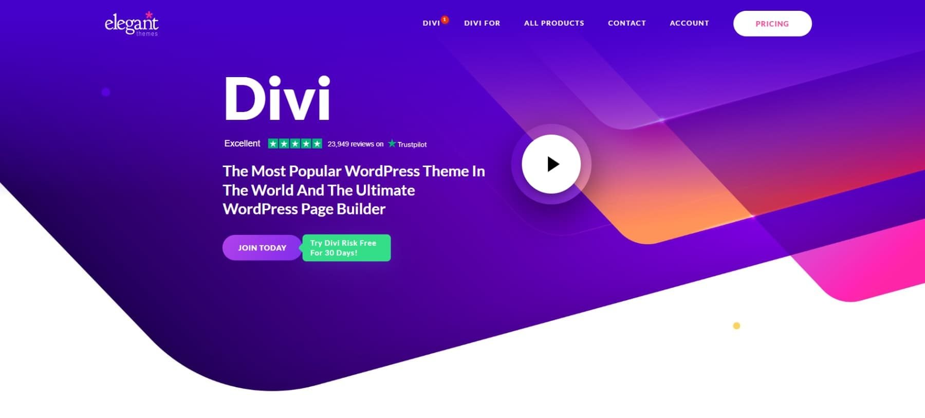
Today’s search engines care about three things: technical performance, user experience, and clean code structure. Divi’s architecture is specifically engineered around these ranking factors, making it a powerful tool for SEO-focused websites.
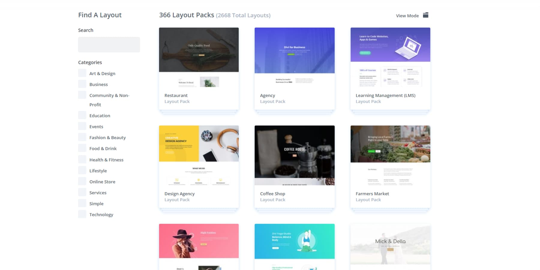
Starting with user experience, Divi offers 2000+ premade layouts that help you create ranking-ready websites with minimal effort. These layouts aren’t just visually appealing – they’re built following the highest web design standards. Combined with 200+ built-in modules, you have everything needed to create engaging, user-friendly websites that keep visitors returning.
Build, Optimize, Rank: Divi AI Meets SEO Plugins
Need something more tailored? Divi Quick Sites with Divi AI can generate complete websites based on your business description, including customized images and copy with proper theme builder templates.
Divi AI extends to content creation, helping you generate SEO-friendly copy efficiently. When writing content, Divi AI helps you craft SEO-optimized copy that maintains natural readability while incorporating your target keywords. Whether you’re writing meta descriptions, product pages, or blog posts, the AI understands SEO best practices and helps you implement them consistently.
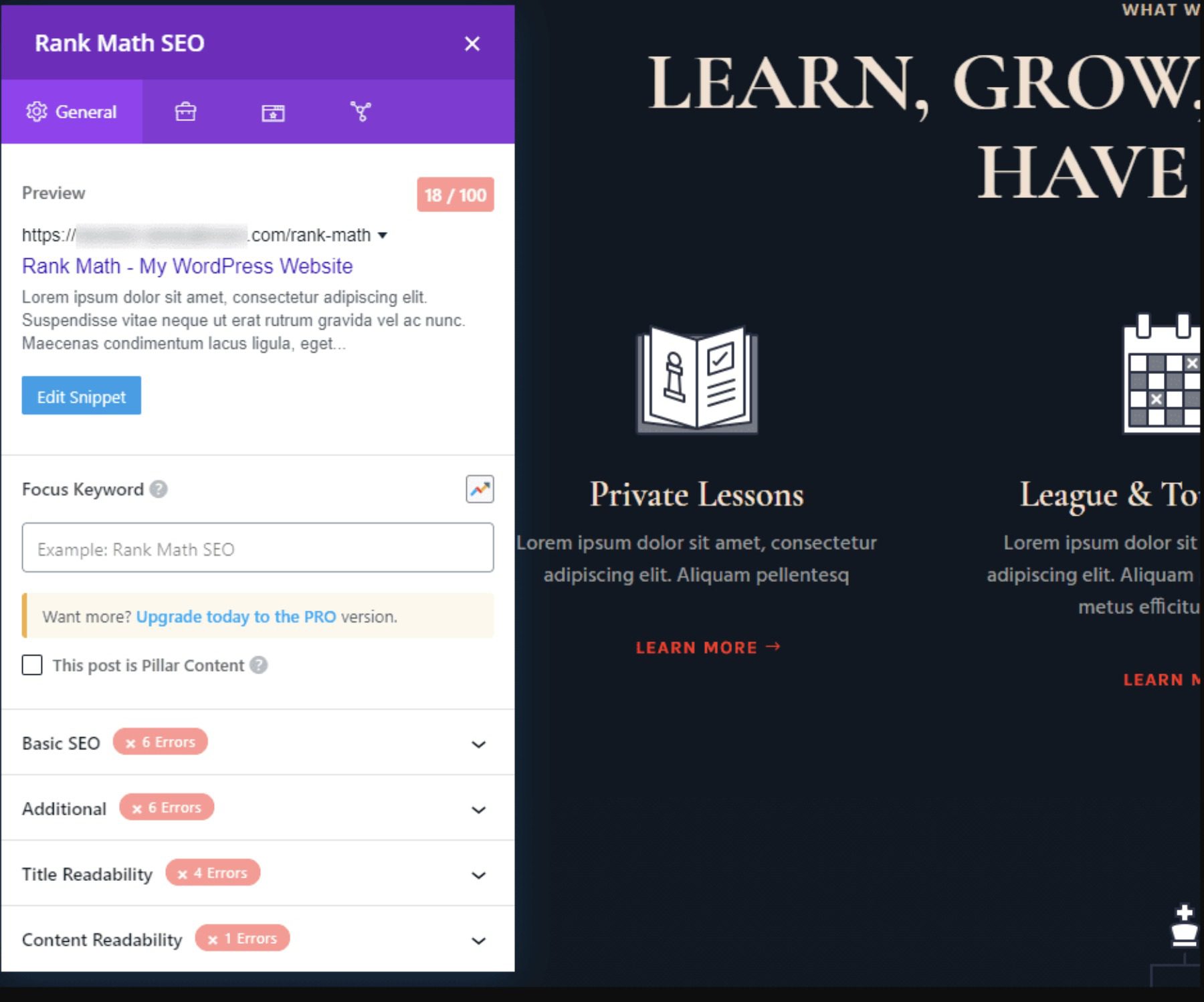
This AI-powered foundation becomes even more powerful when combined with leading SEO plugins. Divi’s integration with tools like Rank Math feels native — you can optimize content, manage metadata, and implement schema markup without leaving the visual editor. The real-time SEO analysis and recommendations appear alongside your content, making it easy to fine-tune your optimization strategy as you build.
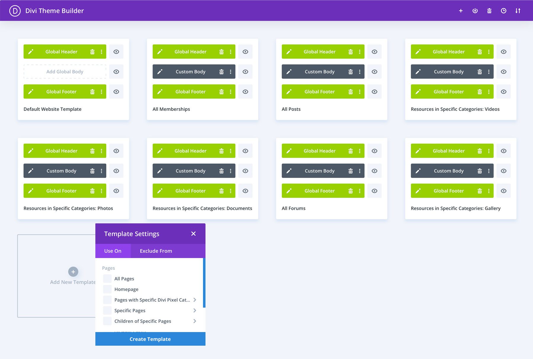
The Theme Builder takes SEO structure to the next level, ensuring consistency across your site through custom templates for blog posts, products, and other content types. This systematic approach to site architecture is exactly what search engines reward.
Performance Optimization, Not An Afterthought
Under the hood, Divi’s visual builder generates clean, efficient code while providing real-time design control. Divi maintains a lean output that search engines can quickly parse.
Performance optimization is built into Divi’s core. The Dynamic Module Framework processes only the functions in use, while Dynamic JavaScript and CSS reduce bloat. Critical CSS enables faster rendering and is integrated directly into the builder.
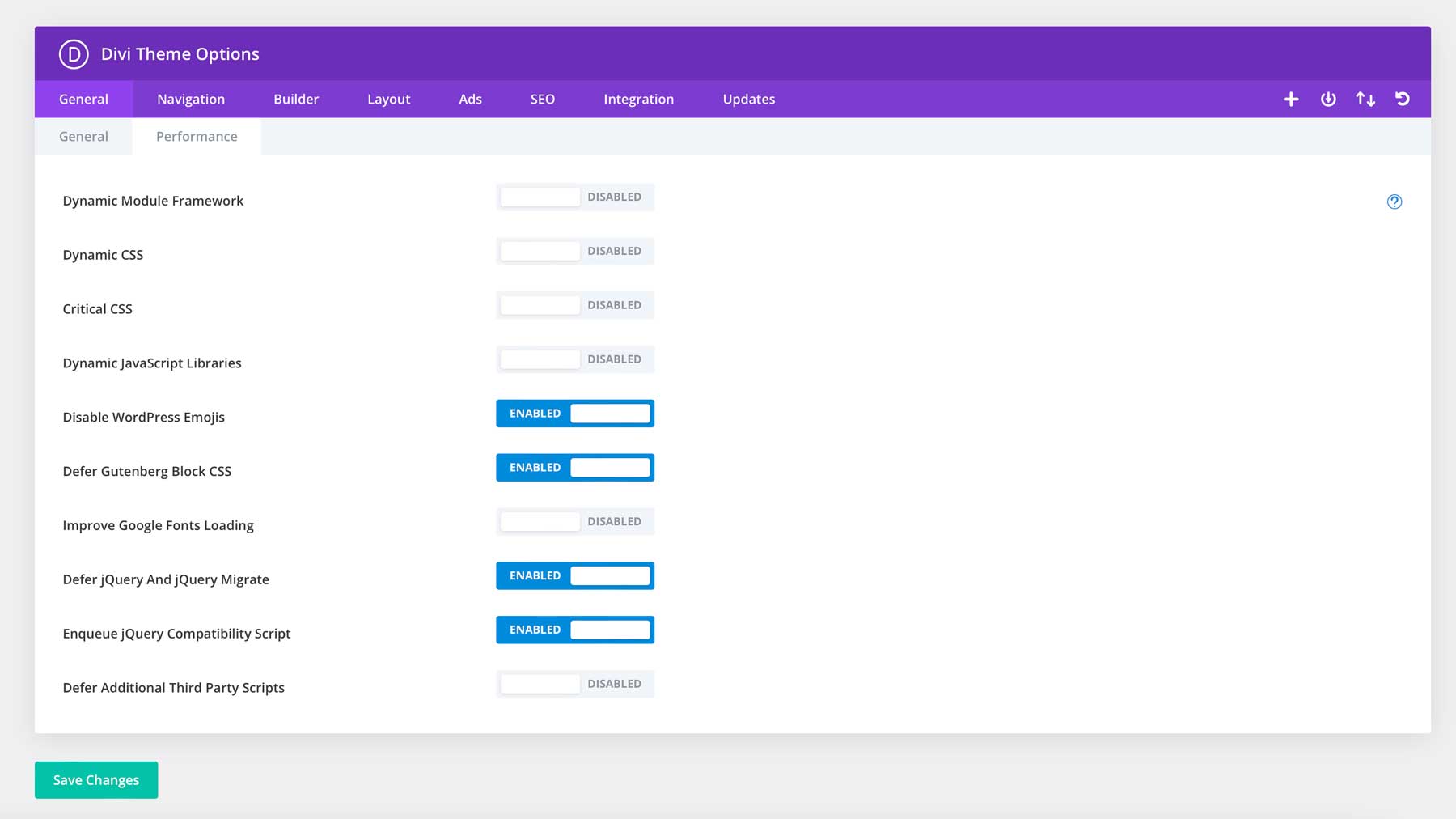
This performance-first approach extends to third-party compatibility. Divi works seamlessly with popular caching plugins like WP Rocket and image optimization tools like EWWW Image Optimizer, creating a comprehensive optimization stack.
Whether building a local business site or scaling an eCommerce platform, Divi’s clean code output and optimization features help translate your SEO efforts into better search visibility. The real value? You never have to choose between beautiful design and technical excellence — Divi delivers both.
Web Design & SEO: Common Mistakes To Avoid
Even well-intentioned design choices can undermine your SEO efforts. Understanding these common pitfalls helps you make informed decisions that support both visual appeal and search performance. Here are the key mistakes I have seen repeatedly – even the many experienced web design and SEO professionals make them- and, more importantly, how to avoid them.
1. Hidden Content & Overlay Abuse
Hidden content seems like a clever design solution – tucking away secondary information until users need it. But search engines view hidden content differently than human visitors. When content stays permanently hidden behind toggles, accordions, or overlays, search engines might devalue or ignore it entirely.
Common examples include stuffing critical information into modal windows, hiding mobile menus on desktop views, or relying too heavily on accordion sections. While these patterns can work when implemented thoughtfully, overuse creates disconnected content that search engines struggle to evaluate correctly.
The solution lies in strategic implementation. Use progressive disclosure patterns that maintain content visibility while managing visual complexity. The key is keeping primary content visible while using interactive elements to enhance, not hide, supporting information.
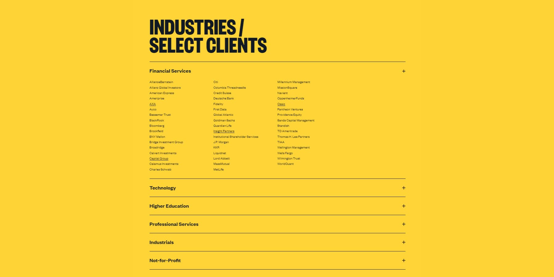
A screenshot of progressive disclosure patterns in an accordion from sullivannyc.com
Ensure overlays and modals add value rather than obscure essential content. Consider whether that pricing table needs to live in a popup or if that essential service description belongs in the main content flow. Remember: if content matters enough to create, it matters enough to make it discoverable for users and search engines.
2. Poor Content Structure
Effective web design and SEO start with proper content structure — the foundation upon which everything else builds. Content structure goes beyond aesthetics — the foundation of how users and search engines understand your website. Poor structure manifests in walls of unbroken text, inconsistent heading hierarchies, and disconnected content sections that leave visitors struggling to find information.
Many websites jump straight to H3s after their page title, skip heading levels entirely, or use headings purely for styling rather than organization. This breaks the logical flow of information and confuses search engines trying to understand content relationships. Even visually appealing layouts can suffer from weak structural foundations.
The solution starts with clear content hierarchies. Each page should follow a logical heading structure (H1 → H2 → H3) that creates natural content groupings. Break long content into scannable sections, use bullet points for lists, and ensure each heading accurately describes its following content. This isn’t just about SEO — it’s about making content digestible for real people.
Supporting elements like images, videos, and interactive features should enhance your content structure, not disrupt it. Place them thoughtfully within your content flow, use descriptive alt text, and ensure they contribute to the overall narrative of your page. Strong content structure creates better experiences for everyone — from first-time visitors to search engine crawlers.
3. Hamburger Menus On Desktop
The hamburger menu — those three stacked lines hiding your navigation — makes perfect sense on mobile devices where screen space is precious. But defaulting to this pattern on desktop screens sacrifices discoverability for minimal aesthetic gain.
Desktop users expect immediate access to navigation options. Hiding these choices behind an extra click reduces engagement and increases bounce rates. Analytics data consistently shows that visible navigation menus on desktops lead to higher page views and longer session times.
Some modern designs hide navigation for a minimalist look, but this often backfires. Users spend more time hunting for basic navigation than engaging with your content. The key is finding balance — clean design shouldn’t come at the cost of functionality.
Instead, prioritize your most important navigation items in a visible menu using dropdown elements for secondary pages. This maintains visual cleanliness while keeping crucial navigation paths immediately accessible. On mobile, that same navigation can collapse naturally into a hamburger menu where the pattern makes sense.
4. Slow-Loading Hero Sections
Hero sections often carry the heaviest visual impact and performance cost. Large background videos, high-resolution images, and complex animations can delay meaningful content from reaching your visitors. When your hero section takes too long to load, users see a blank space, half-loaded images, or a Flash of Unstyled Text (FOUT) where your most important content should be.
First impressions are the last, and they happen fast — within milliseconds of landing on your page. When critical hero content lags, you risk losing visitors before they ever see your message. Core Web Vitals metrics like Largest Contentful Paint (LCP) are directly impacted by hero section performance.
The solution isn’t abandoning impactful hero designs but optimizing them intelligently. Compress images without sacrificing quality, consider replacing video backgrounds with lightweight animations, and ensure text content loads immediately while heavier elements load progressively. Background images should scale appropriately for different devices rather than serving desktop-sized images to mobile users.
Focus on delivering your core message quickly. A fast-loading, well-designed hero section with crisp images and smooth animations will consistently outperform a sluggish one with flashier elements that users don’t see.
5. Auto-Playing Media Content
Auto-playing media might grab attention but often grab it for the wrong reasons. Videos, especially with audio that starts automatically, can startle users, drain mobile data, and create accessibility issues. Search engines understand this negative impact on user experience, making auto-play content a potential liability for SEO.
Beyond irritating users, auto-playing media significantly impacts page performance. Videos loading in the background consume bandwidth and processing power, even when users can’t see them. This leads to slower page loads, higher bounce rates, and poorer Core Web Vitals scores — all of which influence search rankings.
The better approach is to give users control over their experience. Present video thumbnails with clear play buttons, optimize preview images and ensure media loads only when users choose to engage with it. This improves performance and shows respect for user preferences and accessibility needs.
If you must include auto-playing content, implement it thoughtfully. Use muted playback by default, provide obvious controls, and ensure the content adds genuine value to the user experience rather than serving as mere decoration.
6. Too Many Animations
Animations can enhance user experience and guide attention — but like any design element, moderation is key. Excessive animations create visual noise, slow down page performance, and can even trigger motion sickness in some users. When everything moves, nothing stands out.
Many websites fall into the trap of animating every scroll, hover, and click interaction. While each animation might look good in isolation, the cumulative effect creates a distracting, sluggish experience. Search engines measure these performance impacts through Cumulative Layout Shift (CLS) and interaction metrics, potentially affecting rankings.
The solution is purposeful animation. Use motion to highlight important actions, guide users through processes, or provide feedback on interactions. Each animation should serve a clear purpose—whether that’s drawing attention to calls to action, smoothing transitions between states, or helping users understand spatial relationships in your interface.
Keep animations subtle, consistent, and performance-optimized. Consider users who prefer reduced motion, implement proper prefers-reduced-motion media queries, and ensure animations enhance rather than hinder the core user experience.
7. Infinite Scroll Without Pagination
Infinite scroll can create engaging experiences for certain types of content, like social media feeds or image galleries. However, implementing it without proper pagination creates significant problems for users and search engines.
When content loads endlessly without clear page breaks or URL changes, users lose their place if they leave and return. Search engines struggle to index content effectively, potentially missing valuable pages buried deep in the scroll.
Even worse, many infinite scroll implementations break the browser’s back button, frustrating users trying to return to previous content.
The solution combines the best of both worlds. Implement infinite scroll with clear URL updates and pagination markers that allow users to bookmark specific points in your content. Each “page” of content should have its unique URL that loads the correct starting point when shared or bookmarked.
Consider adding “Back to Top” buttons and scroll position markers to help users navigate longer content streams.
Turn These Tips Into Traffic
Design choices and SEO success are inseparable in today’s time and age. Every element — from navigation structure to page speed, content hierarchy, and mobile responsiveness — directly impacts how search engines evaluate your site. By avoiding the pitfalls we’ve covered and implementing proven design principles, you create experiences that satisfy users and search algorithms.
But understanding these web design and SEO fundamentals isn’t enough — execution matters. Divi transforms these best practices into reality, handling technical SEO requirements while giving you the creative freedom to design without compromise. Its optimized architecture, AI-powered tools, and seamless plugin integrations ensure your design decisions naturally strengthen your search performance.
Build SEO-Ready Sites With Divi
The post Web Design And SEO: Principles & Common Mistakes (2024 Guide) appeared first on Elegant Themes Blog.
# 2024 Guide to Web Design and SEO: Key Principles and Common Pitfalls to Avoid
As we step into 2024, the digital landscape continues to evolve at a rapid pace. For businesses and individuals looking to establish a strong online presence, understanding the interplay between web design and search engine optimization (SEO) is crucial. This guide will explore key principles of effective web design and SEO, as well as common pitfalls to avoid, ensuring your website not only looks great but also ranks well in search engine results.
## Key Principles of Web Design in 2024
### 1. User-Centric Design
User experience (UX) should be at the forefront of your web design strategy. A user-centric design focuses on the needs and preferences of your target audience. This includes:
– **Intuitive Navigation**: Ensure that users can easily find what they are looking for. A well-structured menu and clear calls to action (CTAs) are essential.
– **Mobile Responsiveness**: With mobile devices accounting for over half of global web traffic, your website must be responsive, adapting seamlessly to different screen sizes.
– **Fast Loading Times**: Users expect quick access to information. Optimize images, leverage browser caching, and minimize HTTP requests to enhance loading speeds.
### 2. Visual Hierarchy
Effective web design employs a clear visual hierarchy to guide users through the content. This can be achieved through:
– **Contrast and Color**: Use contrasting colors to highlight important elements, such as CTAs, while maintaining a cohesive color palette that aligns with your brand.
– **Typography**: Choose fonts that are easy to read and establish a clear hierarchy through size, weight, and spacing.
– **Whitespace**: Utilize whitespace strategically to create breathing room around elements, making the content more digestible.
### 3. Accessibility
Designing with accessibility in mind is not just a legal requirement in many jurisdictions; it’s also a best practice that expands your audience. Consider:
– **Alt Text for Images**: Provide descriptive alt text for all images, which helps visually impaired users understand the content.
– **Keyboard Navigation**: Ensure that all interactive elements can be accessed via keyboard shortcuts.
– **Color Contrast**: Use high-contrast color combinations to aid users with visual impairments.
## Key Principles of SEO in 2024
### 1. Quality Content
Content remains king in the SEO realm. Focus on creating high-quality, relevant, and engaging content that addresses the needs of your audience. Key strategies include:
– **Keyword Research**: Identify relevant keywords and phrases that your target audience is searching for. Tools like Google Keyword Planner and SEMrush can help.
– **Content Freshness**: Regularly update your content to keep it relevant and engaging. This signals to search engines that your site is active and authoritative.
– **Multimedia Elements**: Incorporate images, videos, and infographics to enhance user engagement and dwell time.
### 2. On-Page SEO
On-page SEO involves optimizing individual pages to rank higher and earn more relevant traffic. Key elements include:
– **Title Tags and Meta Descriptions**: Craft compelling title tags and meta descriptions that include target keywords and encourage clicks.
– **Header Tags**: Use header tags (H1, H2, H3) to structure your content, making it easier for both users and search engines to understand.
– **Internal Linking**: Create a robust internal linking structure to help users navigate your site and distribute page authority.
### 3. Technical SEO
Technical SEO ensures that your website meets the technical requirements of search engines. Key aspects include:
– **Site Speed**: Optimize your website’s loading speed, as it is a critical ranking factor.
– **Mobile-Friendliness**: Use Google’s Mobile-Friendly Test tool to ensure your site is optimized for mobile devices.
– **XML Sitemap**: Create and submit an XML sitemap to help search engines crawl and index your site more effectively.
## Common Pitfalls to Avoid
### 1. Neglecting Mobile Optimization
With mobile traffic dominating the internet, failing to optimize your website for mobile users can lead to high bounce rates and lost opportunities. Always prioritize responsive design.
### 2. Ignoring SEO Best Practices
Many web designers focus solely on aesthetics and overlook SEO fundamentals. Ensure that your design choices do not hinder SEO efforts. For example, avoid using excessive JavaScript that can slow down page loading times.
### 3. Overlooking Analytics
Failing to implement analytics tools can leave you in the dark about your website’s performance. Use tools like Google Analytics and Google Search Console to monitor traffic, user behavior, and SEO performance.
### 4. Skipping User Testing
User testing is essential to identify usability issues and gather feedback. Skipping this step can result in a website that looks good but fails to meet user needs.
### 5. Ignoring Local SEO
For businesses with a physical

Recent Comments