
In web design, responsive design is not optional—it’s essential. With most users accessing websites on smaller screens, making content responsive is critical to providing an optimal user experience. Divi has long supported responsive editing, but with the release of the Divi 5 Public Alpha, this process has become even more powerful and efficient.
Divi 5 introduces several key improvements that make responsive editing easier than ever before:
- Seamless device switching lets you quickly toggle between desktop, tablet, and mobile views with minimal effort.
- Visual breakpoints provide real-time feedback as you make changes, allowing you to perfect your design for every screen size.
- Canvas scaling enables you to see how your design looks across multiple devices by adjusting the canvas so you can optimize layouts without guesswork.
In this post, we’ll explore these exciting features and show you how simple it is to make your websites fully responsive in Divi 5.
Learn more about the Divi 5 Public Alpha and how to download it. 👇
Why Is Responsive Design Important?
Responsive design ensures your website looks great and functions well on all devices – from desktops to mobile phones. This is crucial for user experience, engagement, and search engine optimization (SEO).
Visitors who can’t easily read or navigate your content are likelier to leave. By investing in responsive design, you’ll improve page load times, likely increase conversions, and boost your position in search engine results pages (SERPs).
Now that we understand the importance of responsive design, let’s explore how Divi 5 makes the process easier and faster.
Differences In Responsive Editing From Divi 4 To Divi 5
As we transition from Divi 4 to Divi 5 (currently in Public Alpha), users will have a new, improved way to design responsively. Divi 4 laid a solid foundation for responsive editing, but Divi 5 takes it to an entirely different level. This new iteration of Divi offers advanced features and a much smoother workflow for handling device-specific layouts.
Let’s examine the key differences between Divi 4 and Divi 5 regarding responsive design in more detail.
Responsive Editing In Divi 4
In Divi 4, responsive editing relies on switching between device tabs (desktop, tablet, and mobile) at the module level. While effective, this system requires users to frequently toggle between views, which can sometimes feel complex. For example, when editing a text module for smaller devices, you must head to the design tab and click through the responsive icons to adjust the font size for smaller screens.
As a result, editing responsively in Divi 4 can be a bit tedious. While the system works well, the visual preview for each device is less fluid, requiring more time and effort to manage responsive editing. Divi 4 also provides icons at the bottom of the Visual Builder, but that’s mostly so you can preview how your designs will look on various devices.
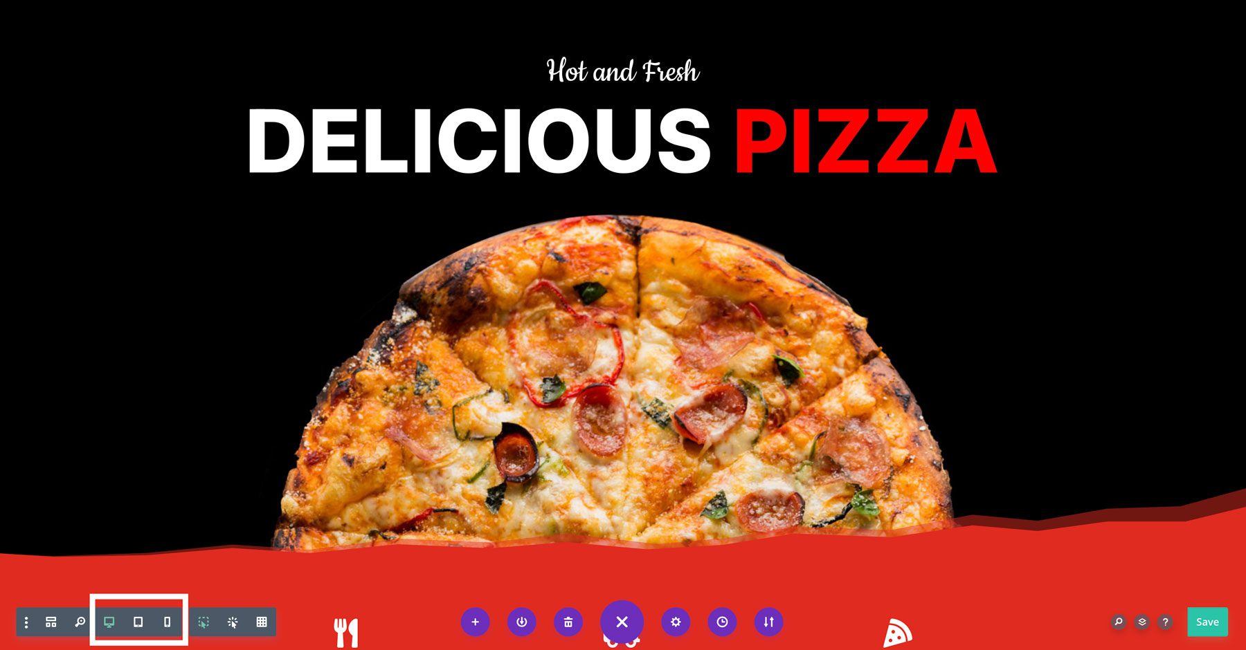
Even with those controls, opening individual modules to make responsive adjustments is necessary.
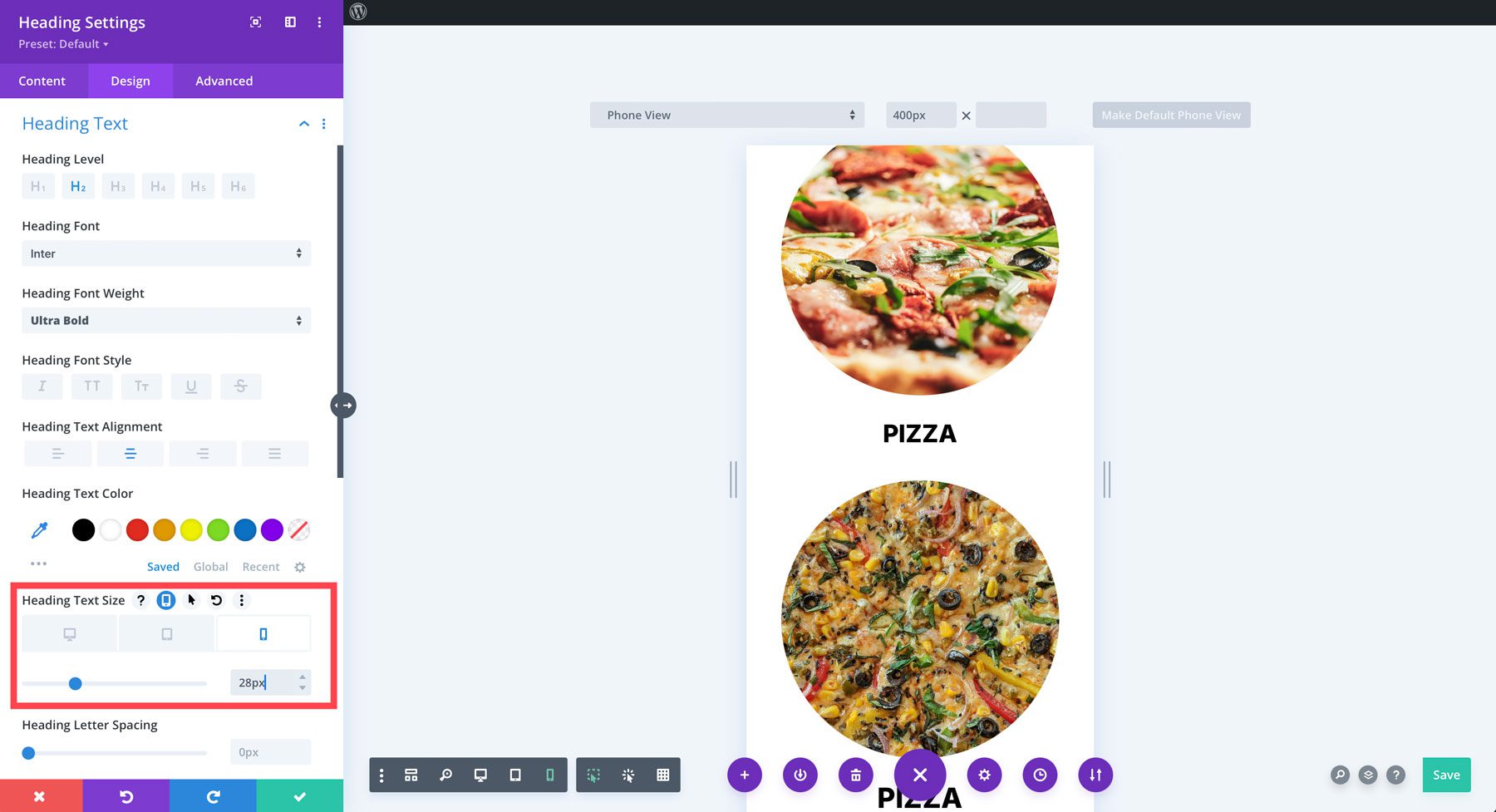
While Divi 4 provided a solid foundation for responsive design, Divi 5 takes these capabilities to the next level. Let’s dive into how Divi 5 simplifies and enhances the responsive editing process.
Responsive Editing In Divi 5
With the release of Divi 5 Public Alpha, you’ll get a much more streamlined process for editing responsively. The new responsive interface allows you to switch seamlessly between device views without repeatedly toggling between settings. The layout remains unified, with all the device-specific controls in one easy-to-access panel.
For example, editing the same text module in Divi 5 only requires one click. Simply click the tablet icon, then the mobile icon, to adjust the text. With that said, while in one of these modes, you can edit all of your modules in one view – with fewer steps.
Divi 5 also introduces visual breakpoints, showing how changes affect various screen sizes in real time as you adjust settings. This makes it easier to visualize the final output while designing and makes the flow between desktop, tablet, and mobile views more intuitive.
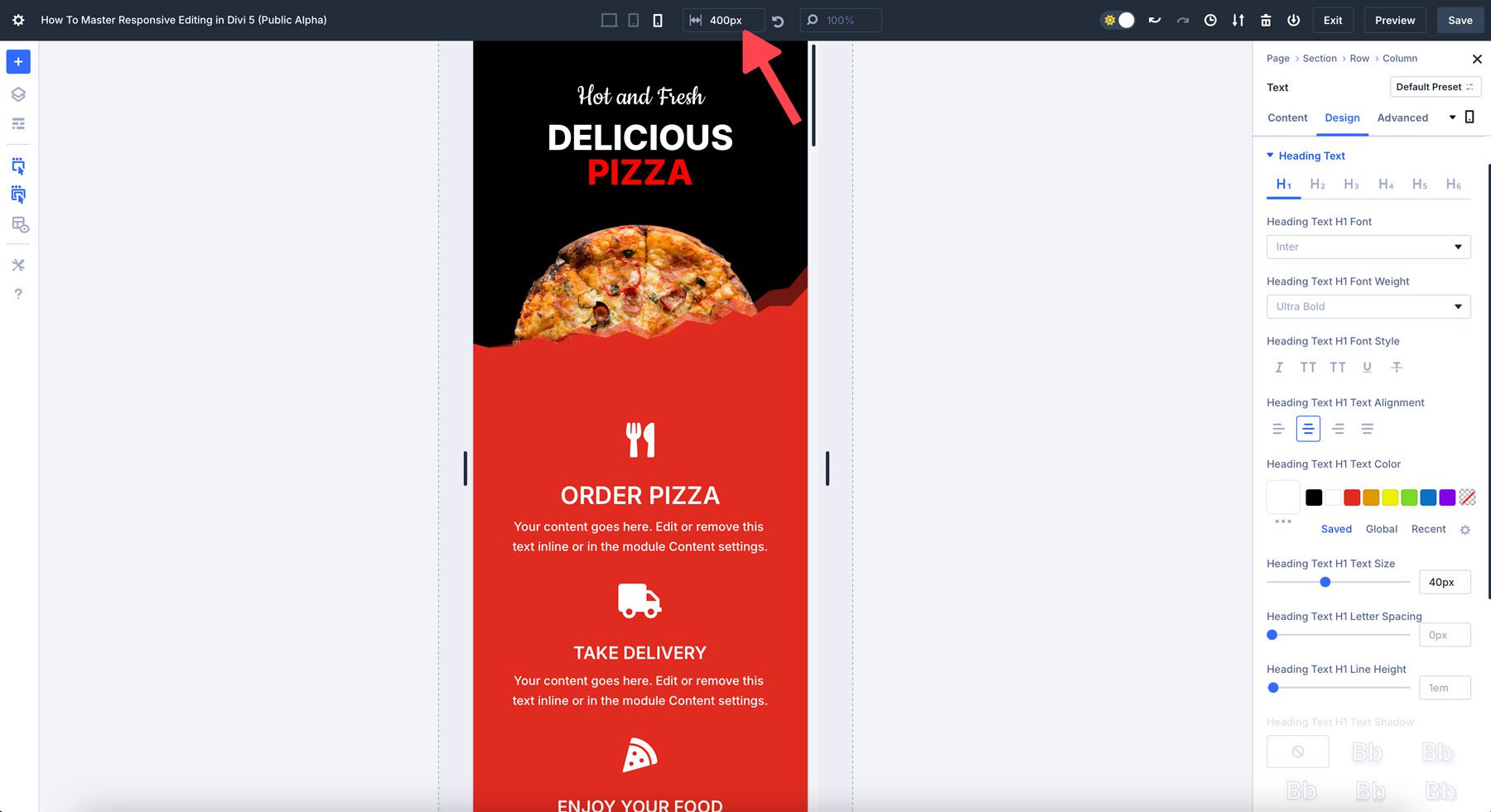
You can quickly click on these device icons and see live previews, offering immediate feedback as you edit. This alone is an improvement over the way you edit designs in Divi 4, but there are more advantages to the way Divi 5 handles responsive design. In addition to this seamless switching, Divi 5 also introduces several other innovative features that make responsive editing even more efficient:
- Seamless Device Switching: Quickly click on device icons to see live previews without lag.
- Advanced Control over Layout Adjustments: Target device-specific breakpoints to change padding or margins, adjust image width, alter font sizes, and more based on a specific breakpoint.
- Canvas Scaling: You can click and drag the canvas to reveal how devices will look across multiple screens (more on this later).
- Performance Improvements: Divi 5 handles responsive editing better, thanks to a completely redesigned framework designed to make the Visual Builder perform better, faster, and without lag.
Divi 5 represents a significant leap forward in responsive editing compared to Divi 4. The ability to switch between device views, set specific viewpoints, utilize canvas scaling, and streamline backend improvements contribute to a much smoother responsive design process. With Divi 5, you can create responsive websites faster and more precisely.
| Feature | Divi 4 | Divi 5 |
|---|---|---|
| Device Switching | Requires frequent toggling | Seamless switching between views |
| Visual Breakpoints | No real-time breakpoints | Live breakpoints for more accurate edits |
| Canvas Scaling | None | Dynamic scaling for multiple devices |
| Performance | Can lag with complex designs | Improved speed and efficiency |
How To Master Responsive Editing In Divi 5 (Public Alpha)
Mastering responsive editing in Divi 5 requires understanding the key tools and features for adjusting your design to accommodate multiple screen sizes. Before diving into these tools, it’s important to familiarize yourself with Divi 5’s responsive interface, which has been enhanced to improve both efficiency and design quality. Here’s a step-by-step guide on how to master them.
1. Familiarize Yourself With The Responsive Editing Interface
Divi 5 has drastically improved the way you edit web pages responsively. The first step is becoming familiar with the interface and the tools available. There are two ways you can edit responsively in Divi 5: through device icons at the top of the Builder or module-specific controls located in every section, row, and module. For most, the easiest way to edit designs is by using the icons at the top of the Builder. However, there may be situations where you need to make quick changes to a single module.
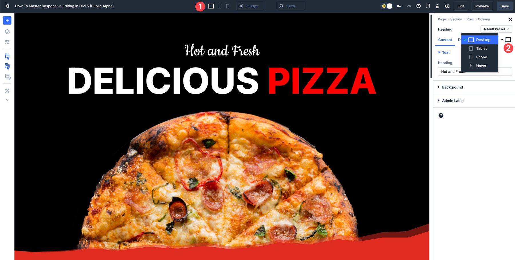
2. Learn to Use Device-Specific Controls
Divi 5 utilizes device-specific controls for customizing designs for different screen sizes. When working with modules, you can adjust each element’s appearance for desktop, tablet, and mobile views without affecting the others.
Learn how to modify padding, margins, and alignment for each viewpoint to ensure layouts are perfected on smaller screens.
Use the text settings to control fonts’ size and properties for different screen sizes. For example, when using large headlines on desktop, it’s almost always necessary to adjust them for smaller screens. When working in mobile view, you can easily copy a module’s style and apply it to a similar module to save time and keep designs consistent.
3. Utilize Visual Breakpoints
Divi 5 introduces visual breakpoints, allowing you to adjust elements based on specific screen width thresholds. These breakpoints can be used for more than just the default tablet or mobile settings. Divi 5’s breakpoints help you adjust layouts for smaller or larger screens in real time.
For example, an iPhone 14 has a screen width (390px), which is different from a Samsung Galaxy S7 (360px). Therefore, it’s a good idea to cater your layout to the smallest screen size to ensure your web page is accessible and error-free for everyone. By default, Divi 5’s mobile breakpoint is 467px.
4. Use Dynamic Scaling Options
Responsive websites benefit from dynamic scaling, and Divi 5 supports creating fluid layouts. Instead of using fixed pixel values, experiment with using percentages (%), viewport width (vw), and viewport height (vh) for sizing sections and rows. That way, the design elements will scale proportionately as the screen size changes.
For example, images on your website may look perfect on a desktop but appear too big on mobile. You can use Divi 5’s settings to adjust the width of your images to ensure their proper sizing while giving them ample space on the canvas.
5. Use Canvas Scaling To Preview Designs
In Divi 5, canvas scaling is a great tool for responsive design. It lets you view how your design will display on various screen sizes while maintaining visual integrity. By scaling elements proportionately and preserving design consistency, canvas scaling improves user experience and does it without any lag.
For example, when working in the mobile view, you can drag the edge of the canvas down to 300px wide to preview how your site will look on various mobile devices.
Divi 5 Is A Game-Changer For Responsive Web Design
With Divi 5‘s enhanced responsive editing capabilities, creating a mobile-friendly, visually consistent website has never been easier. From seamless device switching to powerful canvas scaling, Divi 5 empowers designers to craft stunning, fully responsive sites quickly and efficiently. Ready to take your web design to the next level? Dive into Divi 5 Public Alpha today and experience the future of responsive editing for yourself.
The post How To Master Responsive Editing In Divi 5 (Public Alpha) appeared first on Elegant Themes Blog.
# A Comprehensive Guide to Mastering Responsive Editing in Divi 5 (Public Alpha)
As web design continues to evolve, the need for responsive design has become paramount. With the release of Divi 5 in public alpha, Elegant Themes has taken significant strides to enhance the user experience, particularly in the realm of responsive editing. This guide aims to provide you with a comprehensive understanding of responsive editing in Divi 5, equipping you with the tools and techniques necessary to create stunning, mobile-friendly websites.
## What is Responsive Editing?
Responsive editing refers to the practice of designing and adjusting a website’s layout and elements to ensure optimal viewing across a wide range of devices, including desktops, tablets, and smartphones. The goal is to provide a seamless user experience, regardless of the screen size or resolution.
## Key Features of Responsive Editing in Divi 5
Divi 5 introduces several innovative features that streamline the responsive editing process. Here are some of the most notable enhancements:
### 1. **Improved Visual Builder Interface**
The Visual Builder in Divi 5 has been revamped to offer a more intuitive editing experience. Users can now easily switch between different device views (desktop, tablet, mobile) with a simple click. This allows for real-time adjustments, making it easier to see how changes will appear on various devices.
### 2. **Advanced Breakpoints**
Divi 5 introduces advanced breakpoints, allowing designers to set specific styles and layouts for different screen sizes. This feature enables granular control over how elements behave at various resolutions, ensuring that your design looks great on all devices.
### 3. **Customizable Responsive Settings**
With Divi 5, users can customize responsive settings for individual elements. This means you can adjust font sizes, spacing, visibility, and more, specifically for mobile or tablet views without affecting the desktop version. This level of customization is crucial for maintaining design integrity across devices.
### 4. **Responsive Preview Mode**
The new responsive preview mode allows users to see how their design will look on different devices without leaving the Visual Builder. This feature is invaluable for making quick adjustments and ensuring that your site is visually appealing on all platforms.
### 5. **Global Styles for Responsive Design**
Divi 5 allows you to set global styles that automatically adjust based on the device being used. This feature simplifies the editing process, as you can make changes in one place, and they will reflect across all relevant elements, saving time and ensuring consistency.
## Best Practices for Responsive Editing in Divi 5
To make the most of the responsive editing features in Divi 5, consider the following best practices:
### 1. **Start with a Mobile-First Approach**
Designing for mobile first ensures that your website is optimized for smaller screens before expanding to larger devices. This approach helps prioritize essential content and functionality, improving the overall user experience.
### 2. **Utilize the Visual Builder Effectively**
Take full advantage of the Visual Builder’s capabilities. Use the device toggle feature to switch between views frequently, ensuring that your design remains cohesive across all platforms.
### 3. **Test Across Multiple Devices**
While the responsive preview mode is a powerful tool, it’s essential to test your website on actual devices. Different browsers and operating systems can render designs differently, so real-world testing is crucial.
### 4. **Optimize Images and Media**
Ensure that images and media are optimized for various screen sizes. Use responsive images that adjust in size based on the device, and consider using different image formats for different resolutions to enhance loading times.
### 5. **Leverage Built-In Modules**
Divi 5 comes with a variety of built-in modules that are designed to be responsive out of the box. Utilize these modules to save time and ensure that your design is inherently mobile-friendly.
## Conclusion
Responsive editing in Divi 5 (Public Alpha) represents a significant advancement in web design capabilities. By mastering the tools and techniques outlined in this guide, you can create visually stunning, responsive websites that provide exceptional user experiences across all devices. As you explore the features of Divi 5, remember to stay updated with any new enhancements and community feedback, as the public alpha phase is an exciting time for both developers and designers alike. Happy designing!

Recent Comments